고정 헤더 영역
상세 컨텐츠
본문
갑자기 뺑뺑이가 필요해졌다.(보통 Loading 중을 표시할 때 요긴하당)
자바스크립트로도 만들 수는 있지만, 타이밍 조절 때 꽤나 잔 손질이 많이 간당.
이럴때는 CSS를 이용하는 것이 매력적이당.
일단 아래 소스를 복사/붙여넣기로 결과를 먼저 잡아보장. 외울 필요없당.
요걸 항상 시작 템플릿으로 활용해서 필요한 걸 맹글면 그저 좋당.
cssani.html
<!DOCTYPE html>
<html lang="ko">
  <head>
    <meta charset="UTF-8" />
    <title>E7E CSS 애니메이션</title>
    <style>
      @keyframes e7eAni {
        0% {
          opacity: 0;
          color: white;
          background-color: #8a2be2;
          border-radius: 40%;
          transform: scale(0);
        }
        50% {
          opacity: 0.5;
          color: yellow;
          background-color: #613e83;
          border-radius: 15%;
          transform: scale(1.5);
        }
        100% {
          opacity: 1;
          color: white;
          background-color: #8212f3;
          border-radius: 40%;
          transform: scale(1);
        }
      }
      .e7e {
        animation-name: e7eAni;
        animation-duration: 3s;
        animation-timing-function: ease-in-out;
        animation-delay: 0s;
        animation-iteration-count: infinite;
        /*animation: name duration timing-function delay iteration-count direction fill-mode;*/

        background-color: #8a2be2; /* 없으면 색깔 안 먹음 */
        border-radius: 0;
      }
      button {
        margin-top: 50px;
        margin-left: 30%;
        font-size: 3em;
      }
    </style>
  </head>
  <body>
    <button class="e7e">경미니</button>
    <button class="e7e">체킁_</button>
    <button class="e7e">_버튼</button>
  </body>
</html>
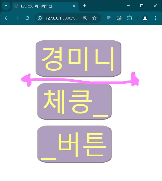
화면 모습이당. 아마도 색깔도 바뀌고 크기도 바뀌고
모서리도 바뀌고를 반복 할꺼이당.
바뀌고 바뀌고 바뀌고를 반복하는 이런 걸
애니라 했던가
결과를 보았다면 이제 이해의 길을 출발 해보장. 해 떴낭?
먼저 애니메이션 동작을 지정해야 한당. 아래 문법으로 한당.
원하는 %를 동작 시간 (duration)의 %로 보면 된당.
곧 animation-duration: 3s 로 설정 되었다면 50%는 1.5초 일때당.(오켕?)
위 설정에서 글자색 color는 처음에는 white 였다가 1.5초때는 yellow가
되어야 하기 때문에 1.5초동안 하얀색에서 노란색으로 서서히 변하게 된당.
@keyframes 원하는이름 {
원하는% { css속성값 }
원하는% { css속성값 }
원하는% { css속성값 }
필요한 만큼 반복 기술
}
애니메이션을 호출해야 동작하게 된당. 호출은 아래처럼 한당.
원하는 태그에 class="e7e" 를 주게 되면 e7eAni를 부르게 된당.
.e7e {
animation-name: e7eAni;
animation-duration: 3s;
animation-timing-function: ease-in-out;
animation-delay: 0s;
animation-iteration-count: infinite;
/* 위 모든걸 아래 처러 한줄로 단축 표현 할 수 있당 */
/* animation: name duration timing-function delay iteration-count direction fill-mode;*/
}
그저 보기만 하면 영어 뜻 그대로 느끼미가 뇌에 느끼하게 자리한다.
animation-timing-function 은 아래와 같은 것들이 제공된당.(동작을 눈으로 보는 게 최선이당)
| 타이밍 함수 | 동작 |
| ease | 디폴트 값으로 천천히 시작 후 가속 후 끝에 다다를 수록 느려진당. |
| linear | 일정한 속도로 변화(transition)가 일어난다. |
| ease-in | 천천히 시작후 끝으로 갈수록 가속된다. |
| ease-out | 빨리 시작 후 끝으로 갈수록 감속된다. |
| ease-in-out | 천천히 시작, 중간까지 가속 , 다시 천천히 |
| step-start | 시작시에 변화가 갑자기 일어난다. |
| step-end | 끝에 변화가 갑자기 일어난다. |
| steps() | 변화(transition)를 몇 스텝으로 나눌지를 정한다. |
이제 뇌가 준비가 되었으닝, 뺑뺑이를 만들어 보자.
spinner1.html
<!DOCTYPE html>
<html lang="ko">
  <head>
    <meta charset="UTF-8" />
    <title>뺑뺑이</title>
    <style>
      /* 뺑뺑이 */
      @keyframes spin {
        0% {
          transform: rotate(0deg);
        }
        100% {
          transform: rotate(360deg);
        }
      }

      /* 뺑뺑이 호출 */
      .e7eSpinner {
        width: 64px;
        height: 64px;
        border: 8px solid;
        border-color: blueviolet transparent darkcyan transparent;
        border-radius: 50%;
        text-align: center;
        line-height: 64px;
        color: chocolate;
        animation: spin 1.2s linear infinite; /* 레알 호출 */
      }
    </style>
  </head>
  <body>
    <div class="e7eSpinner">e7e</div>
  </body>
</html>
분명 뺑뺑이가 돌고 있을 거당. 결과 캡처는 귀안타!~~
뺑뺑이만 가지고는 쓸모가 조금 떨어진당. 모달과 함께 해야 쓸모가 생긴당.
뺑뺑이를 1개만 넣는 게 일반적인 사용법이지만, 여기선 재미를 위해 마니 넣어보았당.
데이터 로딩에 쓰이니, 아작스 페이크도 일부러 살짝 넣어 보았당!
이 모든 게 들어있는 코드가 아래 나의 코드당.
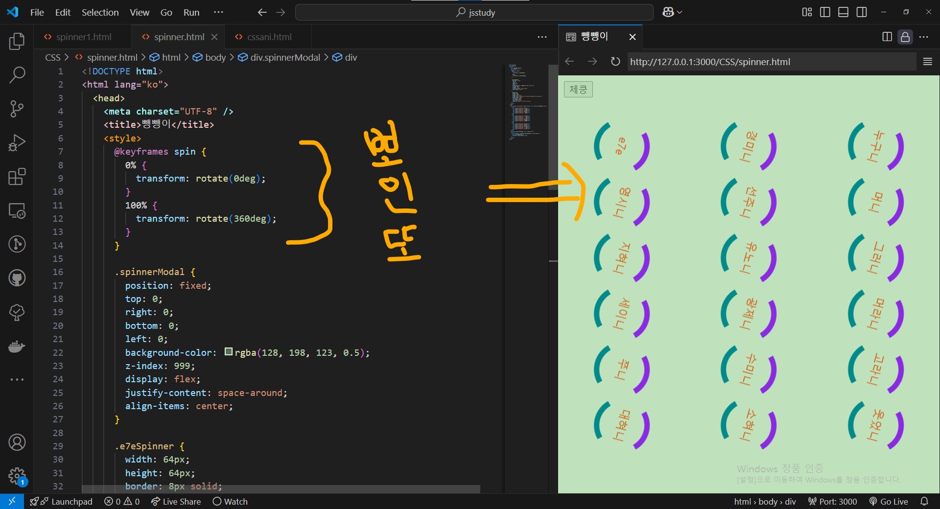
spinner.html
<!DOCTYPE html>
<html lang="ko">
  <head>
    <meta charset="UTF-8" />
    <title>뺑뺑이</title>
    <style>
      @keyframes spin {
        0% {
          transform: rotate(0deg);
        }
        100% {
          transform: rotate(360deg);
        }
      }

      .spinnerModal {
        position: fixed;
        top: 0;
        right: 0;
        bottom: 0;
        left: 0;
        background-color: rgba(128, 198, 123, 0.5);
        z-index: 999;
        display: flex;
        justify-content: space-around;
        align-items: center;
      }

      .e7eSpinner {
        width: 64px;
        height: 64px;
        border: 8px solid;
        border-color: blueviolet transparent darkcyan transparent;
        border-radius: 50%;
        text-align: center;
        line-height: 64px;
        color: chocolate;
        animation: spin 1.2s linear infinite;
      }
    </style>
  </head>
  <body>
    <div class="spinnerModal" style="display: none">
      <div>
        <div class="e7eSpinner">e7e</div>
        <div class="e7eSpinner">영시니</div>
        <div class="e7eSpinner">지혀니</div>
        <div class="e7eSpinner">세이니</div>
        <div class="e7eSpinner">쭈니</div>
        <div class="e7eSpinner">대혀니</div>
      </div>
      <div>
        <div class="e7eSpinner">경미니</div>
        <div class="e7eSpinner">선주니</div>
        <div class="e7eSpinner">유노니</div>
        <div class="e7eSpinner">광제니</div>
        <div class="e7eSpinner">수미니</div>
        <div class="e7eSpinner">소혀니</div>
      </div>
      <div>
        <div class="e7eSpinner">누구니</div>
        <div class="e7eSpinner">머니</div>
        <div class="e7eSpinner">그러니</div>
        <div class="e7eSpinner">머라니</div>
        <div class="e7eSpinner">고라니</div>
        <div class="e7eSpinner">웃었니</div>
      </div>
    </div>
    <button onclick="asyncLoad()">체킁 데이터로딩</button>
    <section id="kmlist"></section>
    <script>
      const SpinModal = document.querySelector(".spinnerModal");
      const kmlist = document.querySelector("#kmlist");

      function spinShow(set) {
        SpinModal.style.display = set;
      }

      async function asyncLoad() {
        SpinModal.style.display = "flex";
        kmlist.innerHTML = "";
        const imsiDatas = await getDatas();
        imsiDatas
          .map((data) => {
            let h1t = document.createElement("h1");
            h1t.innerHTML = `${data}님`;
            return h1t;
          })
          .forEach((h1e) => kmlist.appendChild(h1e));
      }

      // 아작스 페이크
      async function getDatas() {
        const dummy = ["경","민","우","아","설","영","선","주","현","명","지"];
        return new Promise((resolve) => {
          setTimeout(() => {
            let ranData = [];
            Array.from({ length: 5 }).forEach((_, i) => {
              let ranN1 = Math.floor(Math.random() * dummy.length);
              let ranN2 = ranN1 == dummy.length - 1 ? 0 : ranN1 + 1;
              ranData.push(`${dummy[ranN1] + dummy[ranN2]}`);
            });
            spinShow("none");
            resolve(ranData);
          }, 2000);
        });
      }
    </script>
  </body>
</html>
결과는 아래와 같당. 실제 사용때는 어지러우니 스피너 1개만 쓰도록 하장!
뺑뺑이를 하나 가지게 된 게 그저 이렇게 맘이 부자당당!~~ ㅋㅋ
어쩌다 난 이런 사라미 되었을까?
저기 거울 속의 난 내가 마즐까?
낯설다......
A.I에게 물어볼까?
질문 자체를 이해할까?
이질감이다.....
여긴 어디고?
난 누구인가?
혼탁하다......
이런 나의 미스터리 attitude!!
아!! 어제 술 마니 마셨징!~~
혀는 발레리나 attitude로 초밥을 부른당.
https://www.youtube.com/watch?v=38xYeot-ciM
'React' 카테고리의 다른 글
| React(리액트) 티키타카 24 (useDebounce Hook 2) (2) | 2025.03.12 |
|---|---|
| React(리액트) 티키타카 23 (useDebounce Hook 1) (2) | 2025.03.11 |
| React(리액트) 티키타카 22 (Redux -2) (0) | 2025.03.05 |
| React(리액트) 티키타카 21 (Redux -1) (0) | 2025.03.04 |
| 도커(Docker) 이미지로 맹글깅 (0) | 2025.02.20 |


